
Layout
Learn how to arrange elements on a web page using CSS layout techniques like Flexbox and Grid.
As the name suggests, layout is about arranging elements on the page in a specific way.
The two most common ways to lay out elements are Flexbox and Grid.
Flexbox Layout
Flexbox is short for Flexible Box.
Flexbox is a one-dimensional layout model for arranging items in a single row or a single column.
Flexbox relies on a parent-child relationship between HTML elements.
- Flex Container (the parent): Any HTML element that has its
displayproperty set toflexorinline-flex. - Flex Items: The direct child elements inside that container.
Flexbox layout uses two perpendicular axes:
- Main Axis: The primary axis along which flex items are laid out. By default, the main axis is horizontal (left to right).
- Cross Axis: The axis perpendicular to the main axis. By default, the cross axis is vertical (top to bottom).
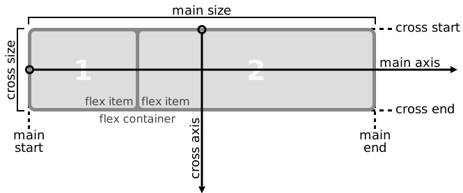
Try a live example of flexbox here:
The related flex properties are:
flex-direction: Defines the direction of the main axis (row or column).justify-content: Aligns items along the main axis (start, end, center, space-between, space-around).align-items: Aligns items along the cross axis (start, end, center, stretch, baseline).flex-wrap: Determines whether items should wrap onto multiple lines (nowrap, wrap, wrap-reverse).gap: Sets the gap between flex items.flex: A shorthand property that combinesflex-grow,flex-shrink, andflex-basisinto a single declaration.
Grid Layout
Grid layout is a two-dimensional layout model for arranging items in rows and columns.
Grid consists of a parent container (grid container) and child elements (grid items).
- Grid Container: Any HTML element that has its
displayproperty set togridorinline-grid. - Grid Items: The direct child elements inside that container.
Try a live example of grid layout here:
The related grid properties are:
grid-template-columns: Defines the number and size of columns in the grid.grid-template-rows: Defines the number and size of rows in the grid.grid-gaporgap: Sets the gap between rows and columns.
A common real-world pattern is a responsive grid that doesn’t need a fixed number of columns — it just fits as many items per row as will comfortably fit:
.grid-container {
  display: grid;
  grid-template-columns: repeat(auto-fill, minmax(250px, 1fr));
  gap: 10px;
}
This creates as many columns as fit the container, each at least 250px wide, and automatically wraps to a new row — no media query required.
CSS Display Property
You’ve just used display: flex and display: grid above. Both are values of the same display property, which controls how any element is shown on the page. Here’s the full list of values:
| Value | Description | Example |
|---|---|---|
| block | The element is displayed as a block-level element, taking up the full width available. | <div> |
| inline | The element is displayed as an inline element, taking up only as much width as necessary. | <span> |
| inline-block | The element is displayed as an inline-level block container, allowing it to have a width and height. | <span style="display:inline-block"> Inline Block </span> |
| none | The element is not displayed at all (it is hidden). | <div style="display: none;">Hidden</div> |
| flex | The element is displayed as a block-level flex container, enabling the use of flexbox layout. | <div style="display: flex;">Flex Container</div> |
| grid | The element is displayed as a block-level grid container, enabling the use of grid layout. | <div style="display: grid;">Grid Container</div> |
| inline-flex | The element is displayed as an inline-level flex container, enabling the use of flexbox layout. | <span style="display: inline-flex;">Inline Flex Container</span> |
| inline-grid | The element is displayed as an inline-level grid container, enabling the use of grid layout. | <span style="display: inline-grid;">Inline Grid Container</span> |
| list-item | The element is displayed as a list item, typically used within <ul> or <ol>. |
<li>List Item</li> |